Reviewer Dashboard
In Madoc v2.2 the reviewer dashboard will be the default view for reviews, giving an improved look and feel to the review process.
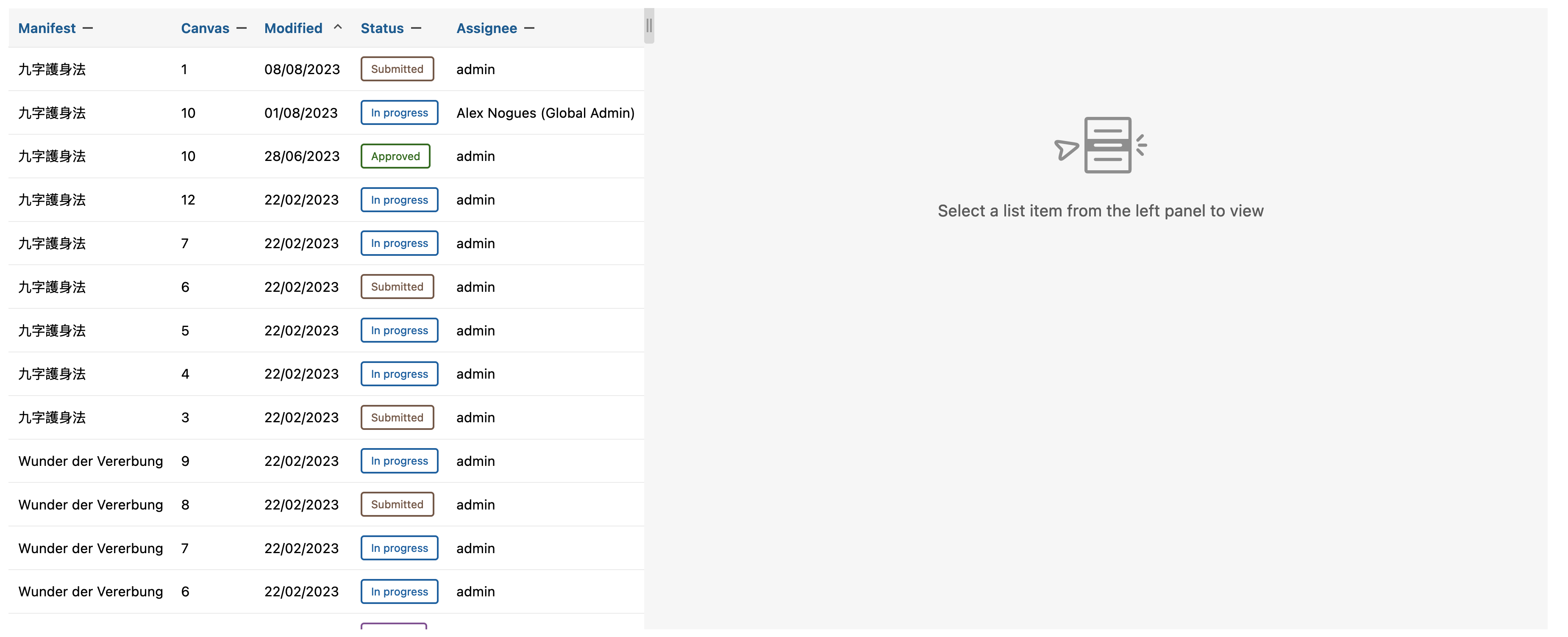
When first landing on the review dashboard, we can see the review list on the left. Once a submission is selected, it will show the submission panel on the right. The two panels can be changed in size by dragging the center handle.
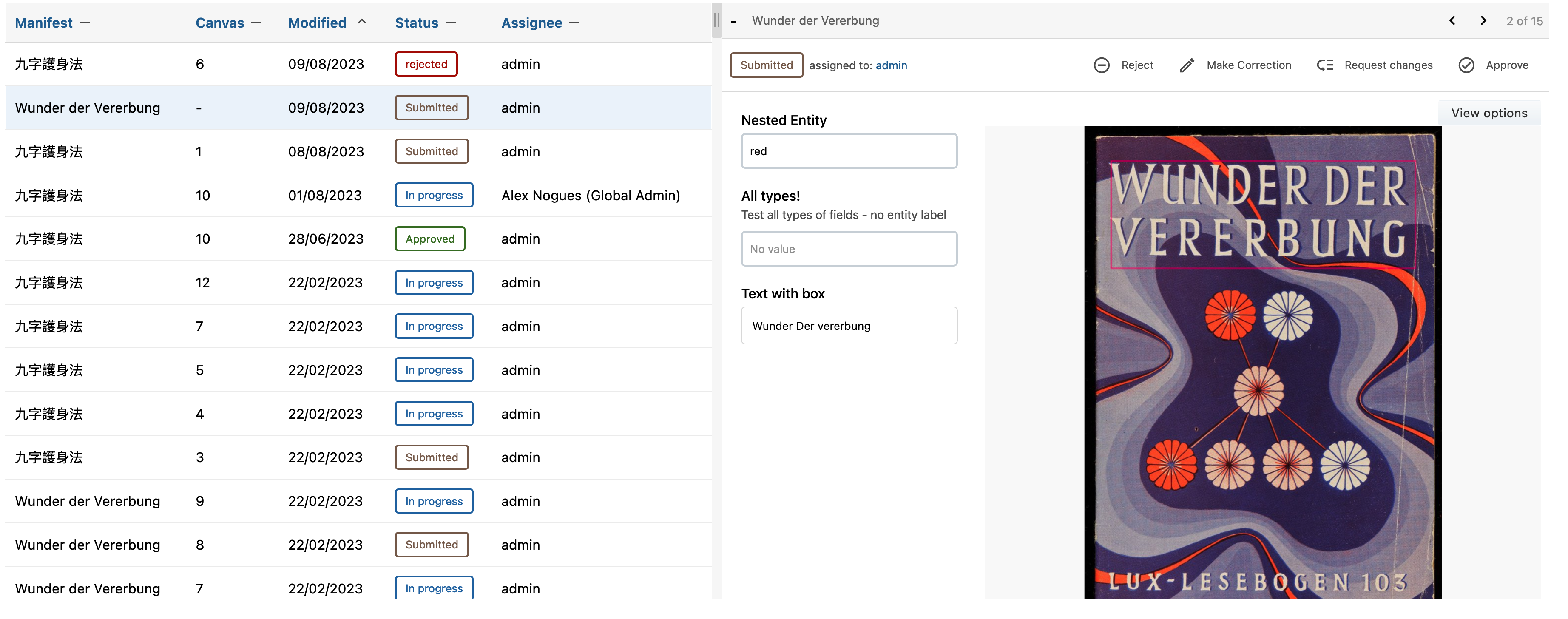
Review List
The review list shows all the contributions for this project. It's sorted by last modified by default, the sorting can be changed to any one of the column headings by ascending or descending.
Manifest - sort the list alphabetically by manifest name
Canvas - sort the list alphabetically by canvas name within its manifest
Modified - sort the list from when each task was last modified
Status - sort the list by status with the order being approved, submitted, in progress, assigned and rejected
Assignee - sort the list alphabetically by the task assignee name
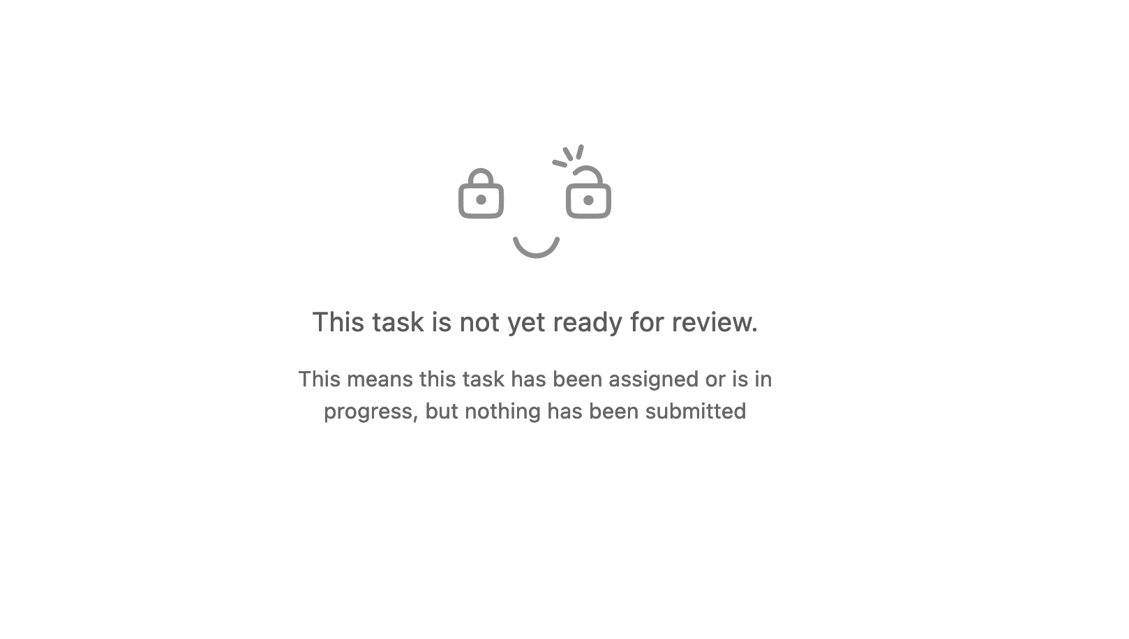
The list will also include in progress and assigned contributions, not all items in the list can be viewed on the submission panel.
Submission Panel
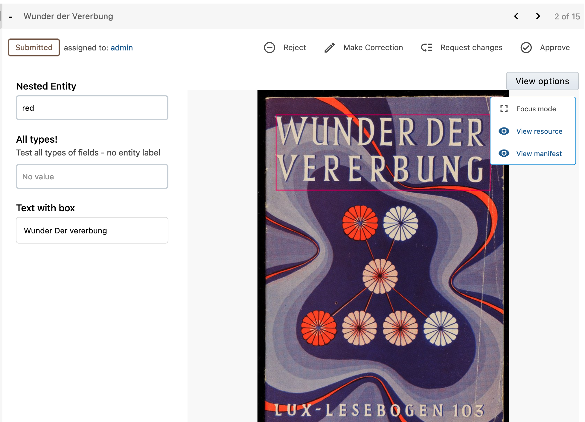
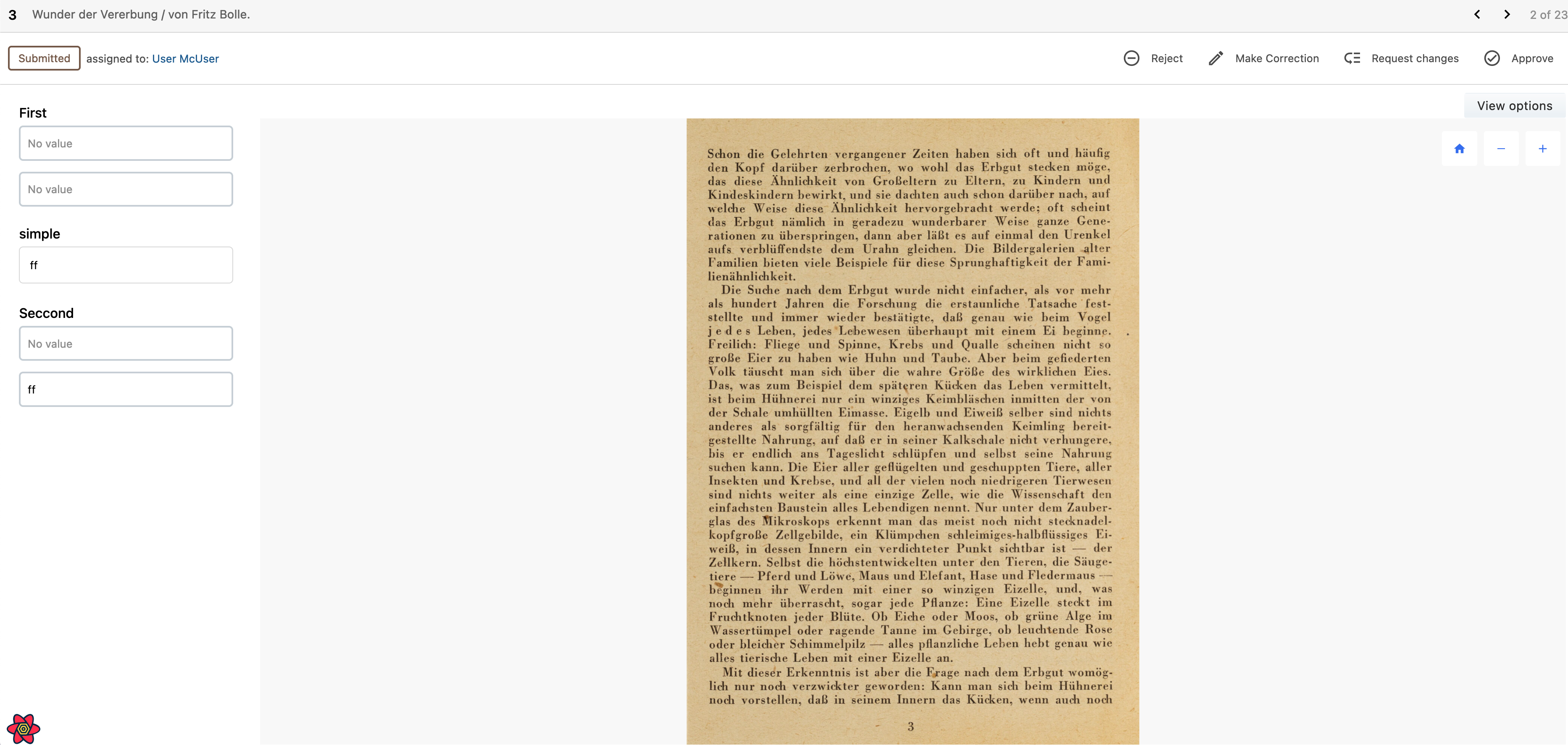
The selected submission can be viewed and actioned on the submission panel with the addition of some useful information such as the assignee, status and resource titles. The submissions can be navigated back and forth by the arrows in the top corner.
The submission can be actioned in multiple ways with the ultimate goal to approve or reject the submission.
Rejecting a submission will mark the contribution as rejected and inform the user, the reviewer will also have the chance to write a message to the user explaining why it was rejected. Once a submission is rejected the resource will be ready to claim again.
Approving a submission will mark the task and contribution as complete (depending on the project settings)
Making a correction is intended for the reviewer to make ad hoc changes to the submission that aren't worth sending back to the user, such as spelling mistakes. Once the correction as been made, the reviewer can approve the submission.
Requesting changes is for bigger changes or corrections. It will mark the contribution as 'changes requested' and notify the user, like a rejection the reviewer has the chance to write a message.
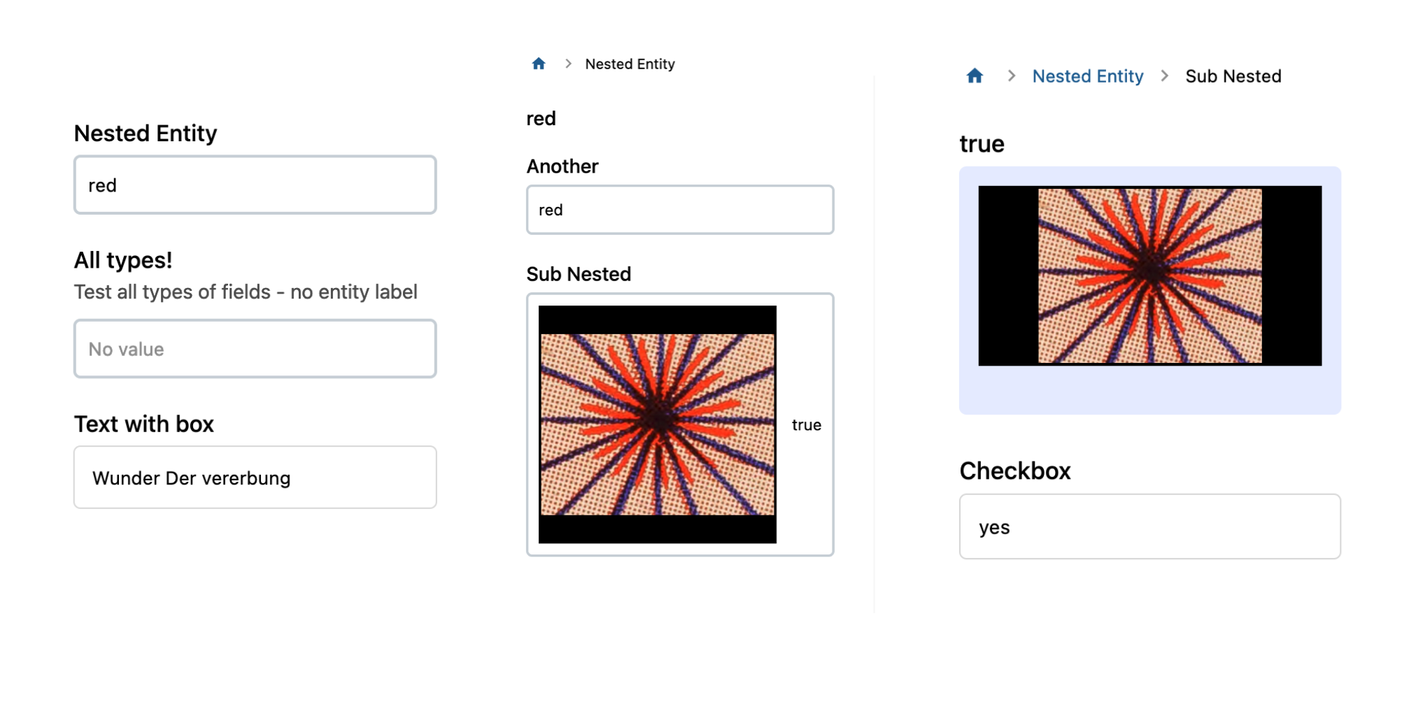
When viewing a submission, we see the form on the left and canvas on the right. Nested entities can be viewed by clicking into the desired field, and the same can be done to view sub-nested entities. To return to the root, the breadcrumbs along the top can be used.
Lastly, there is a focus mode under 'View options' button that allows the reviewer to see the submission panel as fullscreen with all the same actions and information as list mode. Using the navigation arrows, the reviewer can quickly focus on getting through many reviews.
To revert back to the old review page: select project settings -> Interface -> Hide reviewer dashboard